R-creazioni
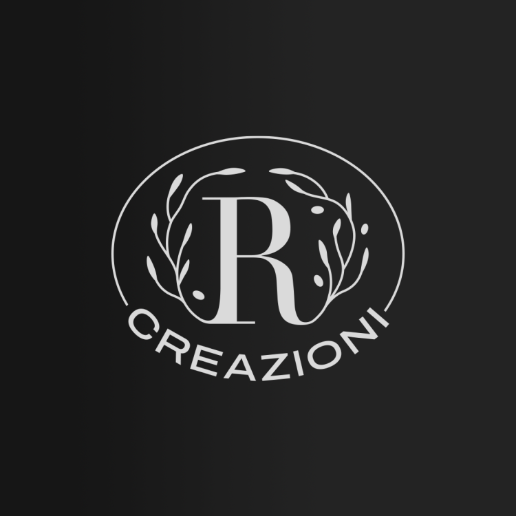
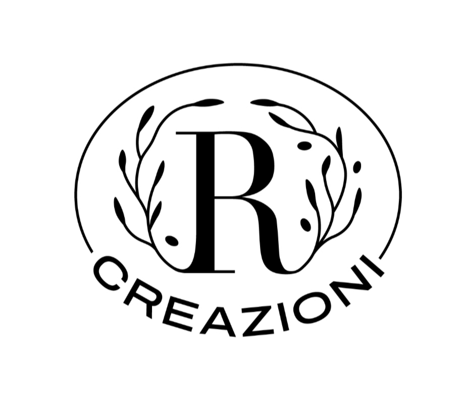
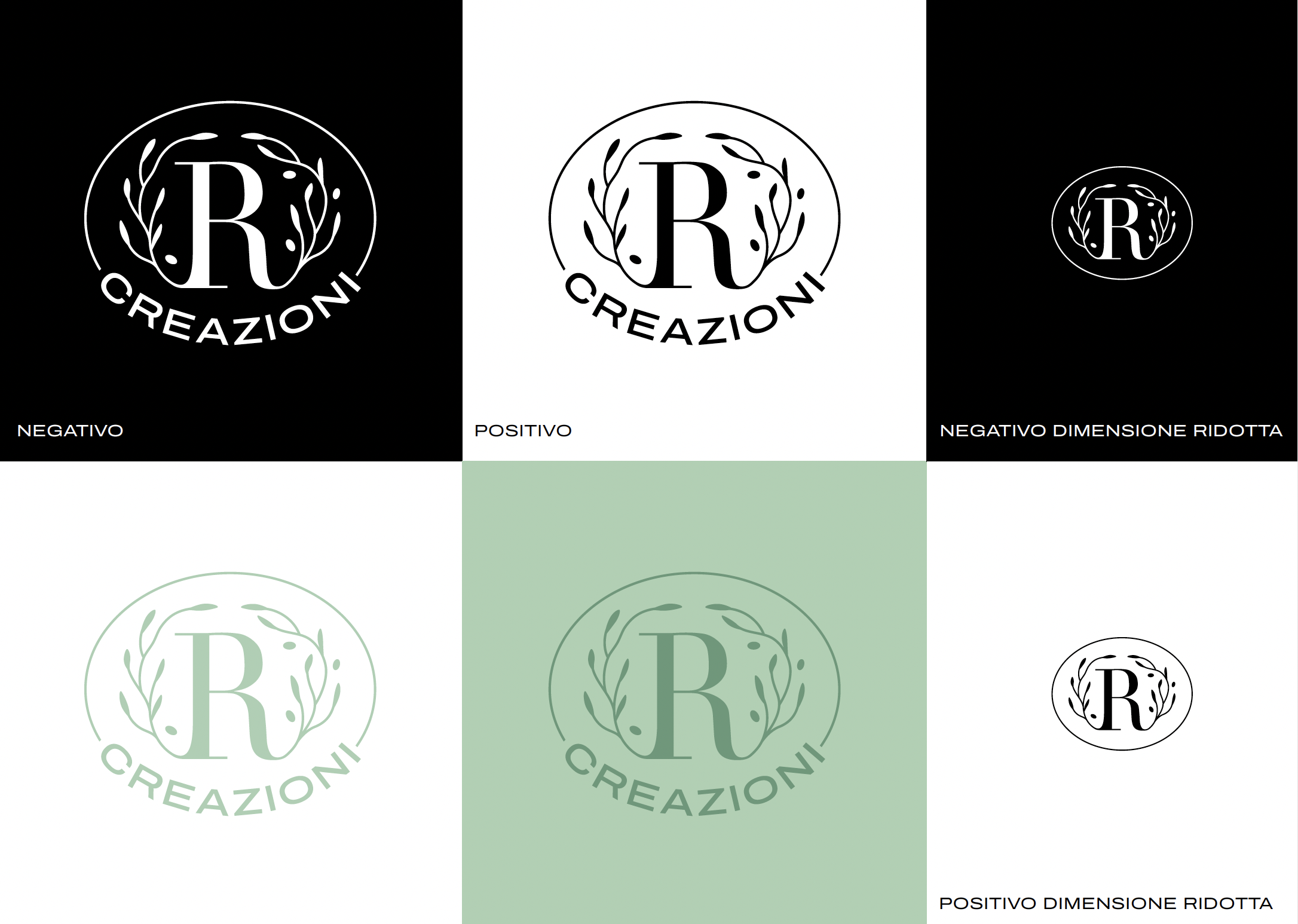
I realized the restyle of the logo of R-creazioni.
Riccardo handcrafts special tables and other objects using olive wood and resin.
The goal was to create a logo that could also be used as a stamp on wood, as an iconic and personal signature.
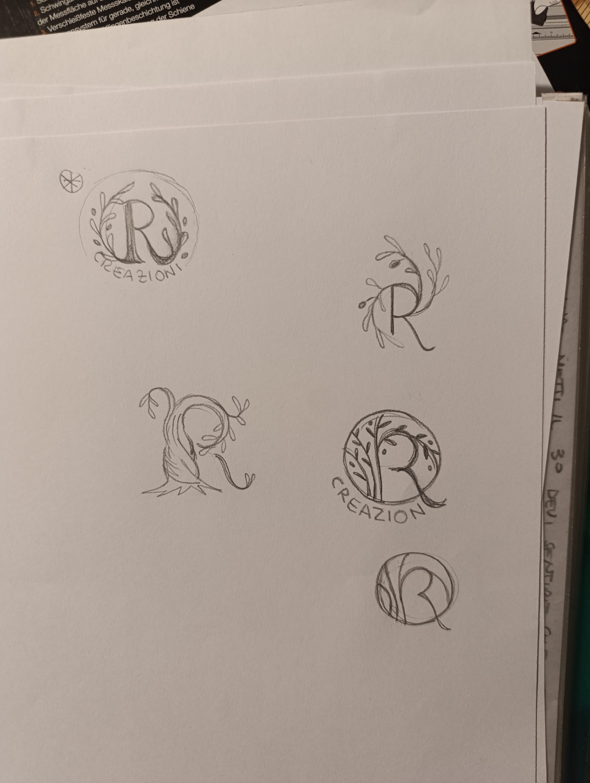
I explored the theme of nature and trees, because his works are mainly made of wood, and the natural and ever-changing grain of the wood is very important in his creations. Nature and trees are also two things really connected to me.
I decided to use a serif font for the R, different from the sans-serif font of his previous logo. The exploration he chose is the one in which I use the reference to olive trees.

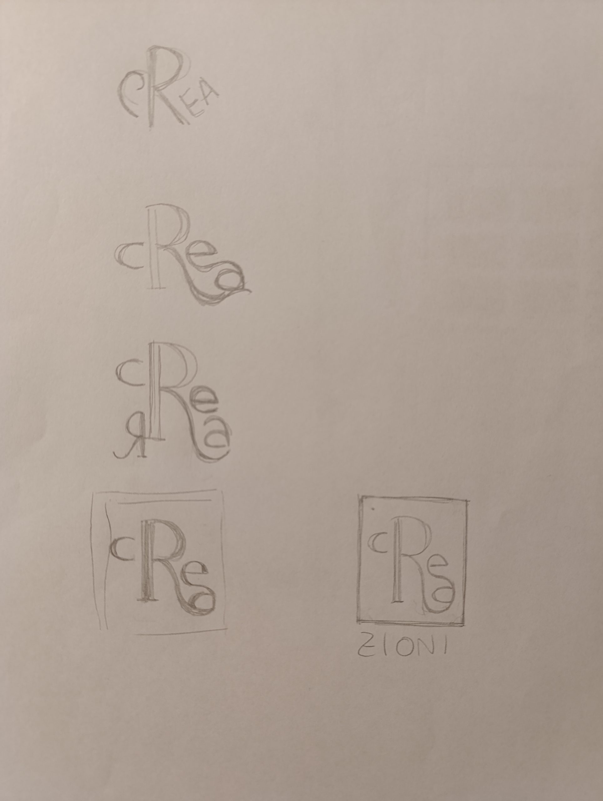
Some of the explorations I did to capture ideas: